Extensibility
PanoramSP provides the ability for developers to build their own custom display templates for use.
These are implemented as SPFx Library Components, with our provided extensibility package added to provide the appropriate types needed in order to implement your own display templates.
Each custom view you build will receive the current page of search results, including any applied filters, as well as the web part's Context object.
You, as the developer, have full control over how a page of results is displayed, including implementing any further rich requirements such as interactive Microsoft Graph calls.
You can view an example reference implementation of a custom view in our github repository for the PanoramSP Extensibility library:
@intelligent-decisioning/panoramsp-extensibility
Pre-requisites
You must have an operational SPFx development environment set up for SPFx 1.22.2 or later.
Please follow the Microsoft guidelines to set up your environment:
Set up your SharePoint Framework development environment
Getting Started
Use the current SPFx supported method (either the yeoman generator, or the new SPFx CLI from SPFx 1.23.0) to create a new SPFx Library Component project.
Install the PanoramSP Extensibility library into your solution:
You will also need to install react direct to your library component project, also:
npm install --save-exact react@17.0.1 react-dom@17.0.1
npm install --save-dev --save-exact @types/react@17.0.45 @types/react-dom@17.0.17
You will likely want to make use of Fluent UI react components, so install the correct version for your version of SPFx:
The PanoramSP search framework takes a dependency on the @pnp/sp package, so you may want to also install this to access types:
Implement the base class. Replace the contents of the standard Library .ts file that the scaffolding process creates with:
import { IPanoramSPExtension, ICustomView } from "@intelligent-decisioning/panoramsp-extensibility";

export class MyNewPanoramSPExtension implements IPanoramSPExtension {
  extensionId: string = "MyNewPanoramSPExtension";

   getViews(): ICustomView[] {
    return [];
  }
}
In the index.ts at root of the src directory, export this class. You may need to correct the path to the file that contains the class, depending on what you named the library when scaffolding the project.
Registering your new custom view
In order for PanoramSP to recognise your new custom templates, you must register them in your implementation of IPanoramSPExtension. This is done by returning entries in the getViews() function, each of which is an instance of a ICustomView object. Here is an example:
   getViews(): ICustomView[] {
    return [
      {
        key: 'my-custom-view',
        displayName: 'My Custom View',
        viewComponent: SampleView,
        validModes: ['news', 'documents'],
        selectProperties: ['Title', 'Author', 'PictureThumbnailURL', 'Path'],
        settings: [
          {
            key: 'some-text-field',
            label: 'Some Text Field',
            type: 'text'
          }
        ]
      }
    ]
  }
Note
At this point, if you get an error at the viewComponent property such as Type FunctionComponent<T> is not assignable to type ElementType<IBaseViewProps> then you may be missing the react types from your dependencies. Ensure @types/react is installed to devDependencies.
Here is an explanation of each of the properties in an ICustomView:
| Property | Description |
|---|---|
key |
This is a unique identifier for this specific view. If you modify this after a web part has been configured to use this view, you will need to reconfigure the web part |
displayName |
This is label of the option to select your view within the PanoramSP web part configuration |
viewComponent |
This is a React component that implements your custom template |
validModes |
This is an array of which modes this view is enabled for. This selection affects the SharePoint Search Query Template that is executed along with the user-applied query, and thus the content class of items that are returned. Valid options are: audio, contentPages, docCentrumDocuments, documents, events, images, listItems, news, people, sites, videos. |
selectProperties |
This is an array of strings of SharePoint Search Managed Properties that you want to return and are thus used in your web part. You can use Managed Property Aliases here. |
settings |
This is an optional array of settings that you want to be able to be configurable by page editors, that are passed into your React component at runtime. |
Basic implementation
What follows below is a very basic implementation of two React components that is used to render a page of results. After is an explanation of the salient parts that you must be aware of when building your custom view.
SampleView.tsx
import React from "react";
import { IBaseViewProps } from "@intelligent-decisioning/panoramsp-extensibility";
import { SampleCard } from "./SampleCard";

export interface ISampleViewProps extends IBaseViewProps {
  someTextField?: string;
}

export const SampleView: React.FC<ISampleViewProps> = (props) => {
  return (
    <div>
      <h2>Sample View 😀 🫡</h2>

      <div style={{
        display: 'grid',
        gridTemplateColumns: 'repeat(3, minmax(0px, 1fr))',
      }}>
        {
          props.data.map((item, index) => (
          <SampleCard
                key={index}
                dataRow={item}
              />
            ))
        }
      </div>

    </div>
  );
};
SampleCard.tsx
import React from "react";
import type { ISearchResult } from "@pnp/sp/search";

export interface ISampleViewProps {
 dataRow: ISearchResult;
}

export const SampleCard: React.FC<ISampleViewProps> = (props) => {
  return (
    <div style={{ border: "1px solid #ccc", padding: "16px", borderRadius: "8px" }}>
      <h3>{props.dataRow.Title}</h3>
    </div>
  );
};
Explanation
First, note the above example is split into two React components: The first one, SampleView represents a full page of results as returned by PanoramSP. In this component, you have complete control over the layout of your items. If you want, you could render a data table using third party components of your choice (or a raw HTML table).
In this example, we demonstrate rendering an individual "card" item in SampleCard. This component is responsibile for the display of a single search result item.
The SampleView component takes in props of type IBaseViewProps. This is important as this base props interface provides your view with the data set in this page of results (in the data property, which is an array of ISearchResult as return by the @pnp/sp library), as well as the PanoramSP web part's SPFx context (in the context property).
The IBaseViewProps object also has passed to it the settings "Disable Share" and "Disable Copy URL" that can be set when a display template is selected. As the developer implementing your custom views, you can choose whether to use these to optionally display these options, but you are responsible for rendering them.
Note the use of the import type syntax in the SampleCard example - this will prevent your solution package from including the @pnp/sp package unnecessarily, when you only require it for development-time type checking.
The React props interface for SampleView is custom interface type that extends IBaseViewProps, and this is done because we have a custom property, someTextField which accepts values that the page editor has provided in the PanoramSP web part properties. This is fully explained in the section below about Custom View Settings.
Custom View Settings
When you register your custom view in the PanoramSP Extension, you can provide a number of custom settings that you want to be configurable at runtime by a page editor. These settings are then passed down as properties to the view so you can consume them at runtime and provide capabilities such as configurable layout options that you may not necessarily want to hard-code in your custom view.
The custom settings are provided via the settings array in the ICustomView instance that represents your custom view. Each of these must provide a key, label, and type.
| Property | Description |
|---|---|
key |
A unique identifier for this setting. There is a connection between this value and the props in your custom view. Explained further below. |
label |
This is the label that appears next to the property's control in the PanoramSP web part properties pane. |
type |
The data type of the setting. This is used to determine the type of UI control that is rendered in the property pane. Possible values: text, checkbox, dropdown, range |
There are also a series of optional properties for a custom view setting:
| Property | Description |
|---|---|
dropDownValues |
If the type of control is dropdown, then this provides a list of objects with a key and value that are used when this setting has one of a set of restricted values. |
rangeMin |
If the type of control is range, this is the minimum value of the rendered slider control |
rangeMax |
If the type of control is range, this is the maximum value of the rendered slider control |
The key Property
The key property if your custom setting can either be all-lowercase dash-seperated-names such as my-custom-property, or in camel case such as myCustomProperty.
Which ever format you use, the value of the setting is passed into the Custom View props with the matching camel case property.
In the above examples, the key of the custom setting was provided as key: 'some-text-field', and the property declaration in the react component props interface was provided as someTextField?: string;.
Thus, when a user enters a value into the text box that appears in the web part property pane, this value is passed down to the custom view in the react component's props for use.
Custom Template Mappings
Within your component configurable template mappings can be added to make use of the configured data from the template mapping data.
Once you have selected your custom template for the selected type. Click the 'Configure' button to open the template mappings panel, in here you can add a template mapping that will be directly referenced in your component. See Template Mappings for how to add a mapping.
The Name property will be the key to reference in your component when getting the mapping value. You will need to ensure users configuring the webpart will have a reference to the list of names used for each custom template.
While creating your component use the getMappingData function to apply the value for the selected property in the configured template mapping.
Debugging & Testing your extension
Once you have build your solution, you must first build and deploy it to your environment (Site Collection App Catalogs work for this technique if you don't want to deploy to the whole tenant initially).
Once this is built, take the sppkg file from the sharepoint folder and upload it to your app catalog. For ease, tick the box labelled `` when deploying in the site collection app catalog. This saves requiring the app to be added to sites before it can be used.
Once this is done, you can start to do live debugging.
Once the debugger local web server is hosting your solution, navigate to a page that has an instance of PanoramSP running on it, and add this to the URL:
Once you accept Load debug scripts prompt, the version of code running on your local machine will then be served.
Once the page is loaded, Edit the PanoramSP web part. When you are in debug mode, the Manage Extensions button becomes visible:
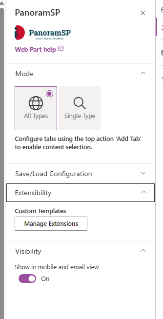
When you click this, enter the Component Id as found in the manifest.json file for your library component, and enter the name (this is simply a label for identification purposes, it's not used in any validation).
Once you have registered your button, select a Mode from the dropdown that is one of the values you have specified in the validModes array in your custom view registration.
Then, under Display Settings -> Display Template, you should see your custom views listed in the dropdown:
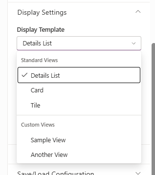
When selected, your custom view will be used to present the page of search results.
Save the page, and when you make changes to the code in your custom view and save, the spfx toolchain will automatically rebuild and the SharePoint page will automatically refresh with your code changes applied.
Deployment & Registration in PanoramSP
Deployment and registration follows many of the steps above for building and deploying to an app catalog.
If you wish to make your template available to only one instance of PanoramSP on a page, you can add ?loadSPFX=true to the URL of the page to enable the Manage Extensions button.
However, if you are also a Mercury customer, you can also use MyMercury settings to make your extension available to every instance of PanoramSP on your SharePoint tenancy.
Simply add the sample Component ID and name to the list of extensions in the PanoramSP settings page of MyMercury, and this will be picked up when the web part loads on a page.